By N.W

Ajoutez votre titre ici

Linear regression for machine learning. The simple regression model and machine learning using python.

This is one of the most basic and well-known algorithms in the statistics and machine learning
community.

In this first post, we will learn;
● The mathematical principles underlying this algorithm.
● The assumptions made when using it.
● How the algorithm is applied.
According to Wikipedia [2], linear least squares regression (which will be discussed in this post), dates
from the 19th Century, published by Legendre and Gauss respectively in 1805 and 1809. Their goal was
to use astronomical observations to determine the orbit of comets around the sun.
Data :
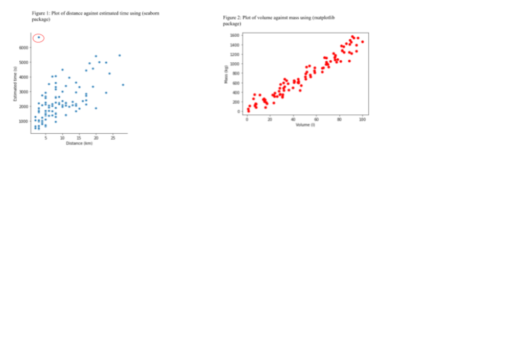
Two datasets are considered here. The first one contains the volume in liters ( ) l of a liquid and the
corresponding mass of the container plus the solution in kilograms (kg). The second dataset consists of
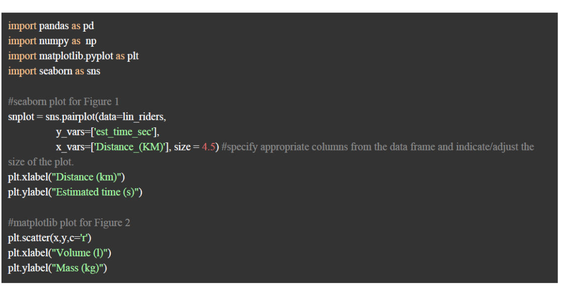
distance measurements in kilometers (km) between a pickup address and the delivery address with the
corresponding time (in seconds) between arrival at the pickup address and the delivery at destination
specified by a client. The latter dataset was downloaded from ZINDI website [1], on the Sendy logistics
challenge, though adapted here to our convenience. The original dataset of more than 30 variables
provides data on order details, bike rider metrics and atmospheric in Nairobi based on orders made on
the Sendy platform. This dataset will be used a number of times in these tutorials and in a constructive
manner.
Now, we explore the datasets visually in the form of scatter plots to view the relationship between pairs of
variables using the following code:

code_python

As a discussion on the figures above (it is of good practice to discuss figures you include in a report or
work), one sees that though the linear relation between the distance between pick-up destination and
arrival destination is not a perfect linear one, there seems to be a linear trend (Figure 1). The linearity
between mass of container + solution and volume of liquid is rather straightforward on Figure 2. Also, we
check the distributions of both variables (response variables , this will be explained y − later) using
histograms. A histogram is a frequency plot that helps assess the frequency distribution of any set of
measurements. The following code using seaborn was used;

Even if we understand LSTMs theoretically, still many of us are confused about its input and output shapes while fitting the data to the network. This guide will help you understand the Input and Output shapes of the LSTM.


Let’s first understand the Input and its shape in LSTM Keras. The input data to LSTM looks like the following diagram.


Understanding Input and Output shapes in LSTM | Keras

0 commentaire